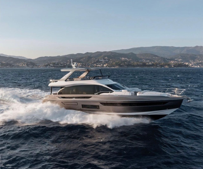
When Giovanna Vitelli picked up the phone to call architect and designer Fabio Fantolino, the Azimut-Benetti Group Chairwoman knew what she was looking for: another decisive step in the updating of Azimut’s offerings.
An upgrade of the Azimut 72 designed by the late Stefano Righini with interiors by Carlo Galeazzi, the new Fly 72 is among Azimut’s latest models to feature an exterior by Alberto Mancini – now responsible for most new S, Fly and Grande series designs. However, for the interiors, Vitelli wanted to work for the first time with Fantolino, despite the fact he had never worked on the design of a yacht.
“They sought out my studio for the interiors after they had carefully examined our styles and analysed the market sectors that our work would appeal to,” Fantolino recalls. “They were looking to upgrade on elegance.”

The upgrade the Azimut-Benetti Group is reaching for with the revamp of its product line is sweeping. Objectives also include lighter, more energy-efficient yachts for a greener, more sustainable approach to life at sea.
With the new model part of Azimut’s Carbon-Tech Generation, Pierluigi Ausonio’s PLANA studio designed the Fly 72’s naval architecture with a hull in GRP and large areas of the superstructure and the beach platform in weight-saving carbon-fibre.
Up top, the carbon-fibre-laminated flybridge is 30 per cent lighter than it would have been if fully built in fibreglass, says the yard. The overall reduction of weight improves fuel efficiency and keeps the boat’s centre of gravity low, always a plus for a planing yacht’s comfort and manoeuvrability.
OUTDOOR SPACES
Mancini has been penning the exteriors of most of Azimut’s new Fly, S and Grande yachts and the consistency of his work has brought a real family feeling to the shipyard’s new offerings. “I always try to create a dialogue between traditional and modern, land-based and seafaring,” Mancini says.

While the yachts he has designed for Azimut have long sweeps of glass that bring lots of light into the interiors, Mancini never designs what he calls “glass shoebox yachts” and always keeps his lines fluid, especially when designing a flybridge yacht that’s sporty in its essence.
“As a designer, I feel I should coax owners back into a more seafaring world because it’s important not to forget that we’re at sea and have to respect it.”
To access the sea, the transom has a high-low swim platform with a fold-down ladder. The hydraulic gangway is telescopic, while the garage can store a 4m tender and a jetski, plus there’s an additional storage locker for toys such as Seabobs and diving equipment.

Up the steps, the aft cockpit has a comfortable C-shaped sofa and a table in synthetic stone. Shaded by the flybridge overhang, the area also has a wet bar that can be closed off to keep a clean look.
A starboard staircase leads to the large flybridge, which has an open aft section that owners can set up as they wish to make the most of the views through a glass balustrade topped by a slender stainless steel rail.
The carbon-fibre hard top has an opening central section and shades an area with couches, a table and a full outdoor galley. The helm station has Raymarine touch screens, while the area around it can be set up with a table or sun pads.

The foredeck is also exceptional and benefits from the extra space provided by the trapezoidal bow shape. Couches and sun pads can be shaded by a hydraulically operated bimini without the fuss of mounting awnings on poles. And the bow’s accentuated flange means water is deflected off the foredeck, so no surprise splashes.
FANTOLINO’S SURPRISE
However, it’s all change inside, after Fantolino responded positively to Vitelli’s request to design the Fly 72’s interiors. “When someone calls your studio, you know they’re looking for your style. Her thoughts on the project and Azimut’s objective for the yacht matched ours. From there, we had an optimal working relationship and made a great team,” he says of his first yachting project.

“It was a challenge, but being an architect is always a challenge. When you’re called to work in a new sector, it’s always a pleasure because it’s a new world, a new opportunity to express yourself. I’m always pushing my design comfort zone; that’s the joy in my line of work.”
Fantolino and his studio started the project with a market analysis, and were surprised at what they found. “We didn’t expect the nautical world to be so isolated from the rest of the design world. It seemed niche and maybe a bit exclusive up to about 10 years ago, then the design world accelerated, and trends changed,” he says.
“The world of transversal design moved ahead while nautical design dropped back. It didn’t look niche anymore. It just looked old and wasn’t keeping pace.”

Fantolino’s goal was to bring the worlds of nautical and transversal design closer together and create an interior where elegance and refinement would also be luxurious.
“Our approach was to update the nautical language with new colours, materials, shapes and combinations. Aboard the Fly 72, we synced luxury design with yacht design and international design by using contradictions, giving contemporary lines to classic materials or creating contrast between straight and curved lines or matte and glossy surfaces.
“The hard part is finding the sweet spot between contrast and comfort in a smaller space because you must also have balance and equilibrium. We wanted to avoid a puzzle of overlapping areas so the space would feel larger and more open.”

WALKING INTO WOW
Large and open is what you feel immediately when you enter the saloon and find long windows in uninterrupted panes of glass, soft shapes, interesting textures and muted colours. Fantolino’s studio also designed all the furnishings, from the lamps to the couches and tables, but that wasn’t enough for Fantolino.
“Aboard a yacht, the exterior is always nearby, and you don’t want to distract from the views, but you still want a wow effect when you enter the interior,” he says. The wow is the galley, which Fantolino recalls as being difficult to design.
“But it was also the spot that gave us the greatest satisfaction as it gives personality to the interior. Working with a single focal point was important because on a yacht everything is physically close to you. Guests should enjoy being inside, so designers must lighten things up. That’s more difficult in a smaller space.”

The galley’s design, with its serving station dressed up in coloured wood, is impressive. Its central location with the dining area across from it makes it a convivial, social area and fits the way we live today, especially when we’re on vacation. Fore of the galley is the helm and a tight crew dinette or games table to port.
STYLISHLY CONSISTENT
Lower-deck accommodation features a VIP cabin fore with a centrally placed bed that benefits from the extra width provided by the trapezoidal bow. The full-beam owners’ cabin is midships and has large, single-pane hull windows in structural glass, a central bed and lots of storage. A TV is concealed behind a magic mirror at the foot of the bed and there’s even a safe in the closet.

There are two further guest cabins, while a separate crew area can sleep two. The look throughout is consistently stylish, due also to the fact that Fantolino has thought of everything, right down to the taps in the bathrooms.
“Chromed faucets are not in fashion anymore,” he says of a small detail that can make a big difference. “Maybe in the nautical world, nobody realised the market was looking ahead and that people didn’t want the same old thing.”
Interiors aside, Fantolino admits to enjoying his time spent aboard the Fly 72 during sea trials, even if he wasn’t focused on the power and performance supplied by the twin 1,400hp MAN V12 engines.

“It was a lovely experience to work in this new world, as it’s very different from anything we had done before. You can learn about managing the storage spaces and how to work within the limitations of materials, and I thank Azimut for helping us to avoid some errors,” he admits.
“The hardest part about nautical design is making a smaller space feel light. The design and quality of materials need to impress, and there are limits on the materials you can use, but within those limits you can still take a lot of steps to lighten the feeling. That said, the experience of being aboard the yacht on the water was even better than I thought it would have been. I wouldn’t change a thing.”
This article was first seen on .
For more on the latest in yachting news, .


